
Case study · Church · Leicester
Covenant Life Church
A table that's always set
Brand strategy, a new identity, a Webflow website and fresh photography for a covenant family in the heart of Leicester.
Visit covenantlifechurch.co.uk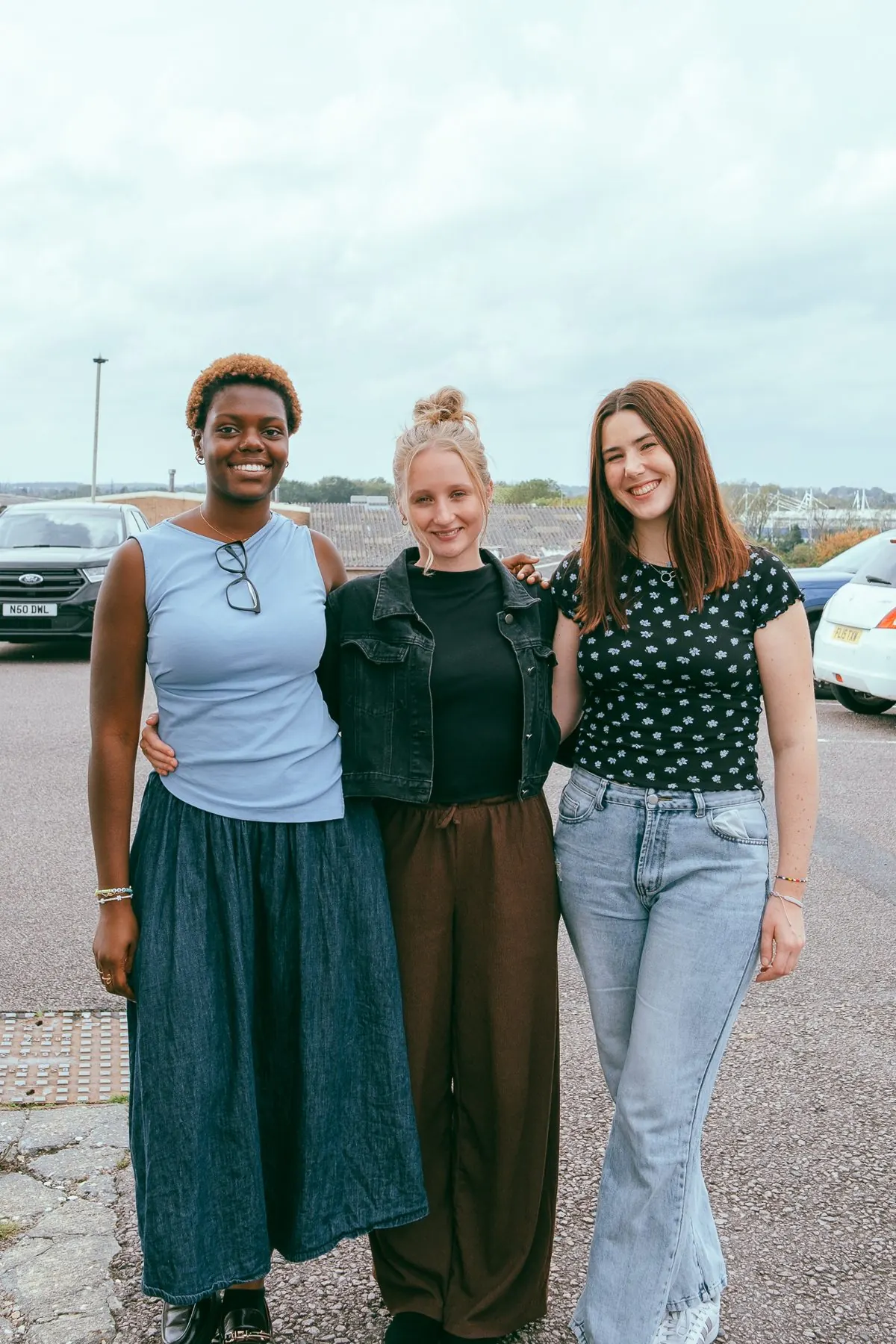
Overview
A family that needed to be visible.
Covenant Life Church meets in The Big Shed on Commercial Square in Leicester. It is a family of people from more than thirty nations, with a deep sense of belonging, care and generous hospitality. The church had heard a clear encouragement to be visible. Good things were happening, but they weren't being communicated well.
The existing identity wasn't helping. A wonky circular logo, bright blue and pink, text laid over the top. It felt dated, inflexible and out of step with who the church had become. When we asked whether the new brand should be an evolution or a revolution, the answer was simple: revolution. Keep nothing.
The brief
- Find the words for who Covenant Life Church really is, and who it is for
- Create an identity that feels warm but not childish, considered but not corporate
- Build a website that helps someone new take their first step
- Capture photography of real church life to carry the brand everywhere
01 / Strategy
Who are we, really?
We spent a large part of this project in the strategy phase, on purpose. Through a series of facilitated workshops we worked with the leadership team through an identity audit, a brand heart workbook, audience personas and alternatives, brand messaging and tone of voice. The aim was to get beneath the language every church uses and find what is genuinely, specifically true of Covenant Life Church.
Purpose
To make Jesus known through covenant love, in our homes, our church and our city.
Mission
We gather as family, go as people of the kingdom, and give ourselves to those around us, so that Leicestershire hears and sees the good news of Jesus.
Vision
A restored Leicestershire where every person encounters the covenant love of God, is totally transformed and finds a place to call home.
Only we…
…are a covenant family who believe the way we love each other is as much a proclamation of the gospel as anything we preach.
Values
- Covenant over convenience. Church isn't something you attend. It's something you belong to, are changed by and give yourself to.
- The table is always set. Hospitality is how we preach. There is always a seat and always a welcome.
- Word and Spirit, without apology. We don't choose between the Bible and the Holy Spirit. We expect both and trust both.
- Kingdom over crowds. Filling a building was never the goal. Everyone in this family has a role in seeing the kingdom come.
- No performance required. Authenticity is the standard, not perfection.
Messaging pillars
- Covenant, not convenience
- The table is always set
- Word and Spirit, no performance required
Tagline
Following Jesus and seeking His Kingdom together.
02 / Audience
Who is this for?
We defined three personas so every later decision, from the logo to the homepage, had a real person behind it.
The Aspirational Reach
Maria, 28
Came to the UK to study and stayed for work. Grew up Catholic, drifted away, and now wants to find Jesus for herself. She would leave if people felt too full on, or if she felt recruited before she felt known. She belongs when she starts taking next steps without being asked.
The Current Core
Richard, 59
A teacher, married for 33 years, who helps with the grandchildren on his day off. For Richard, belonging means long-lasting friendship, shared history and a shared purpose.
The Prodigal
Dave, 19
A student at DMU who decided in his teens that God wasn't interested in him. He is looking for answers and doesn't know who to trust. He would walk away if he felt judged.
The insight: against polished, convenient alternatives, and against a lie-in or Sunday brunch, Covenant Life Church's edge is depth, not slickness. The brand shouldn't compete on production value. It should compete on warmth and family.
Family, not brand. Table, not stage.
03 / The mark
Showing covenant without spelling it out.
Covenant is a big, beautiful and slightly abstract word. The challenge was to show it in a simple, modern mark that felt fresh and not too obvious.

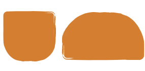
I walked the team through the covenants we find across the Bible and the shapes and images that might represent each one. In the brand identity presentation these sat side by side in one long line, so the final choice could be seen in the context of everything we explored. Each had a story. Each also felt a little expected, or a little distant from everyday church life.
Then we came to the new covenant. On the night before He died, Jesus took bread and a cup and told His friends that this was the new covenant in His blood. It is a covenant made around a table, and remembered around a table.
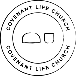
So the mark became two simple forms: a loaf of bread and a cup of wine.
Every time Covenant Life Church shares that meal, they remember the covenant they have with Jesus and with one another. The mark carries that meaning quietly, so it never needs explaining to work, but rewards anyone who asks.
The forms are drawn with soft, brushed edges. Organic, human and alive, deliberately imperfect rather than accidentally wonky, and a natural partner to the line "the table is always set".
04 / Identity
A palette taken from the table itself.
The team chose the "Drawn Together" moodboard, playful, bold and illustrative, and we carried over hand-lettered text laid over photography from the alternative route.
Logo suite
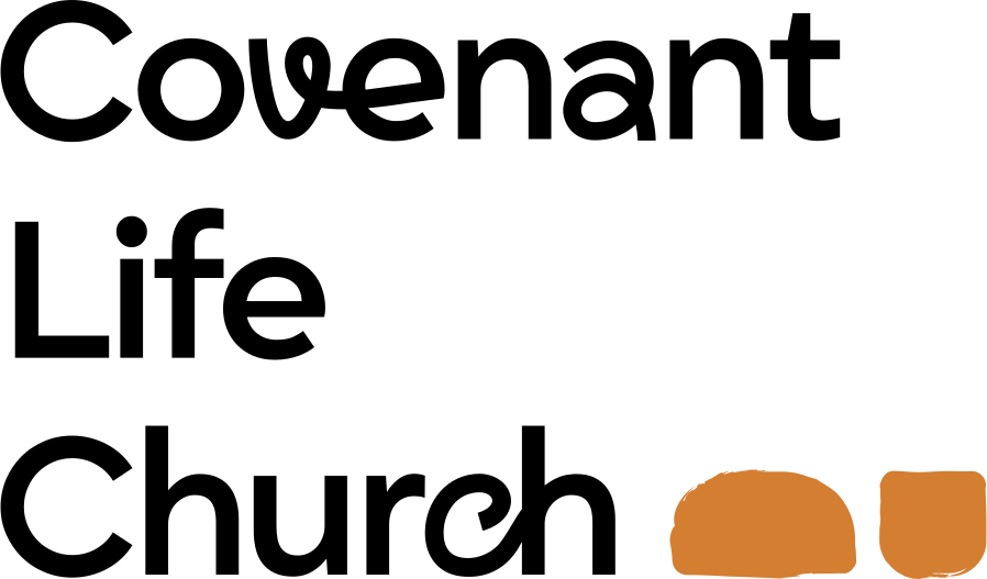
Horizontal, stacked and vertical lockups, a standalone loaf and cup icon in fill and outline, and a circular badge.



Colour
- Burnt Red Wine#662826
- Dusty Rose#B06769
- Bread#DDC8AF
- Orange#D37E31
- Deep Teal#16393A
- Flour#F2EBDC
- Soft Lemon#F8F6C8
- Forest Green#234637
- Pale Sage#AEBBA1
- Moss Green#89A378
- Slate Mist#96A4A8
Typography
- Grift
- Titles
- Figtree
- Headings and paragraphs
- Editorial Today
- Accents
- Space Mono
- Buttons and tags
- Mister Spicy Dos
- Hand-drawn flourishes
05 / Website
Built for someone taking their first step.
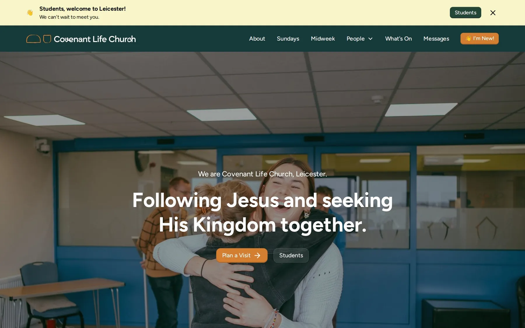
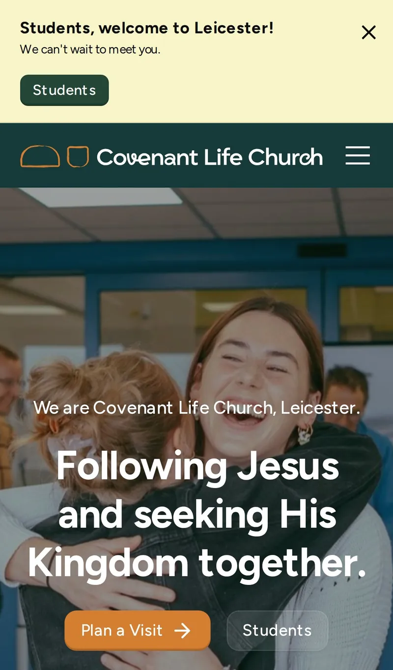
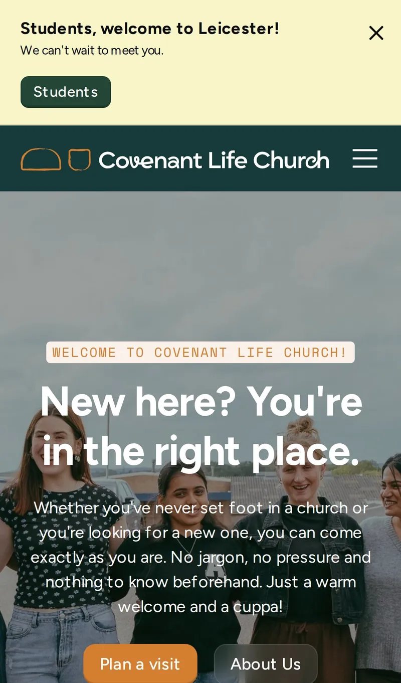
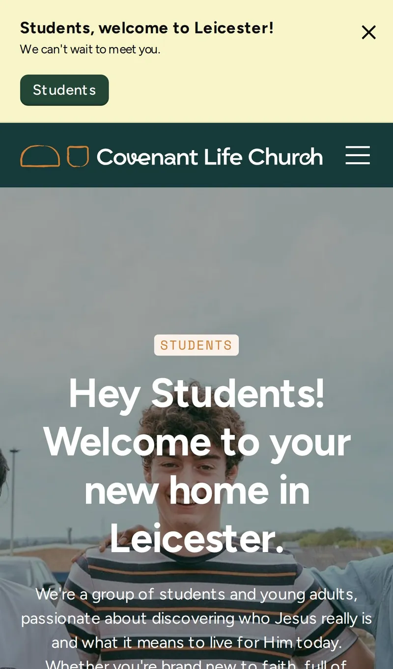
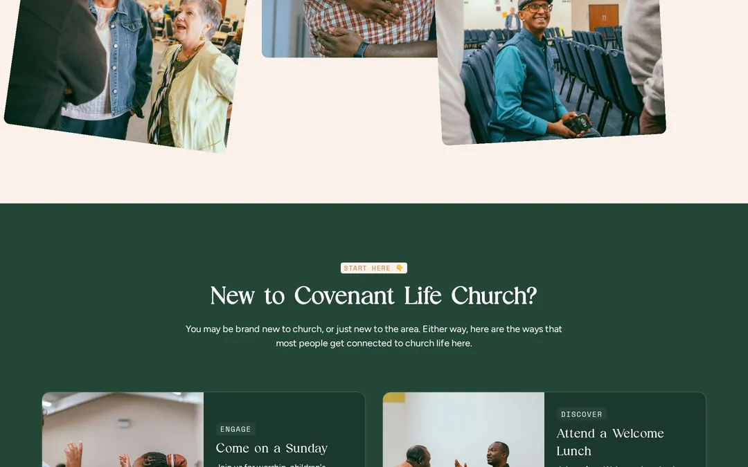
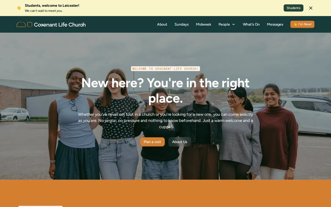
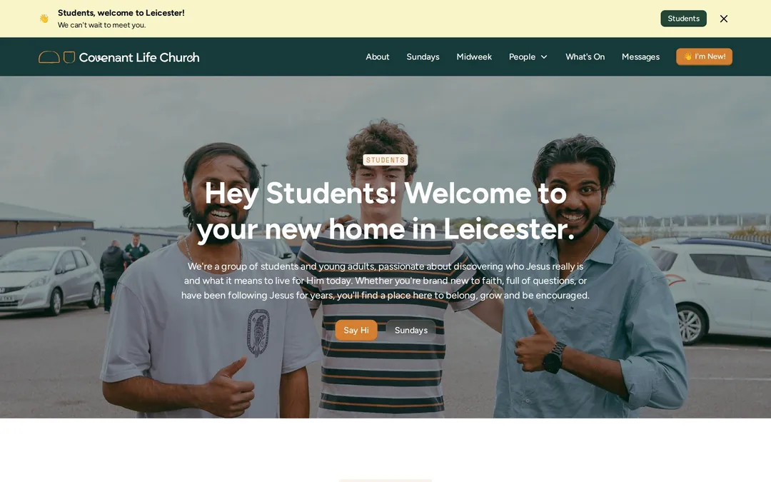
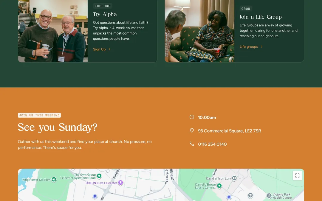
The new site was built in Webflow and launched on 4 October 2026, replacing the church's old WordPress site. It is deliberately simple and photography forward, and every part of it maps back to the personas defined in strategy.
- An "I'm New" route in the main navigation, so Maria never has to hunt for a first step.
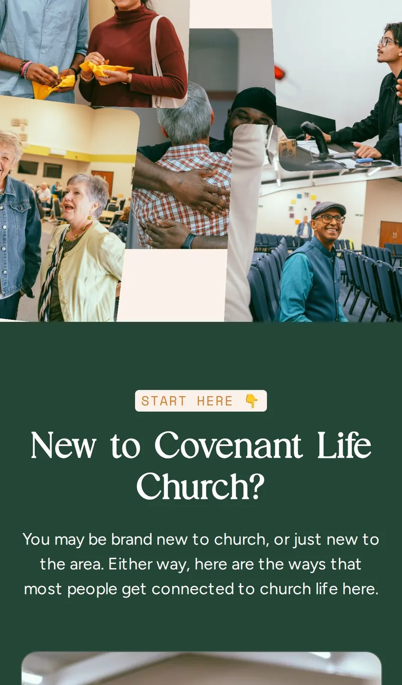
- A "Start Here" journey in four steps: come on a Sunday, attend a Welcome Lunch, try Alpha, join a Life Group. Relationship before recruitment.
- A students banner timed for the start of term, speaking directly to students arriving in Leicester.
- A Messages archive in the Webflow CMS so the team can publish each Sunday's message themselves.
- Plain, warm copy throughout: "No pressure, no performance. There's space for you."
- Plan a Visit, a friendly multi-step form designed to turn curiosity into a first Sunday.
-
Homepage -
Start Here -
I'm New -
Students
06 / Photography
Looks like the church actually feels.
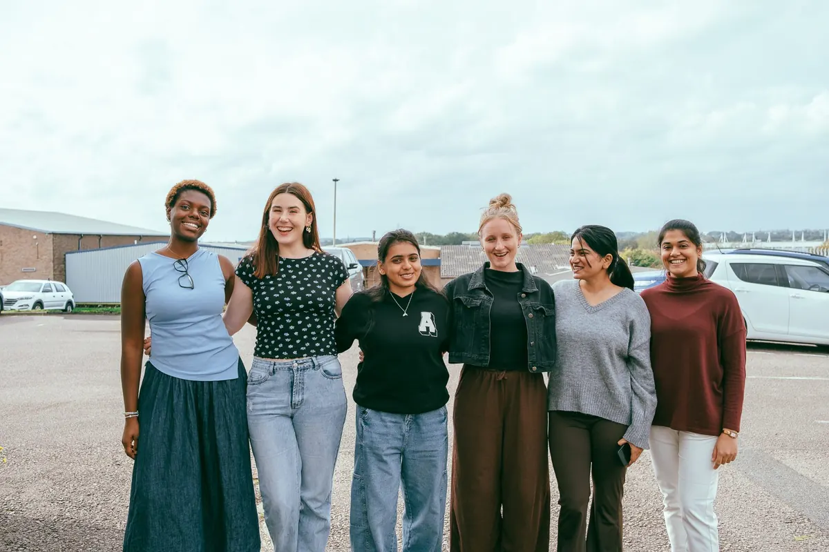
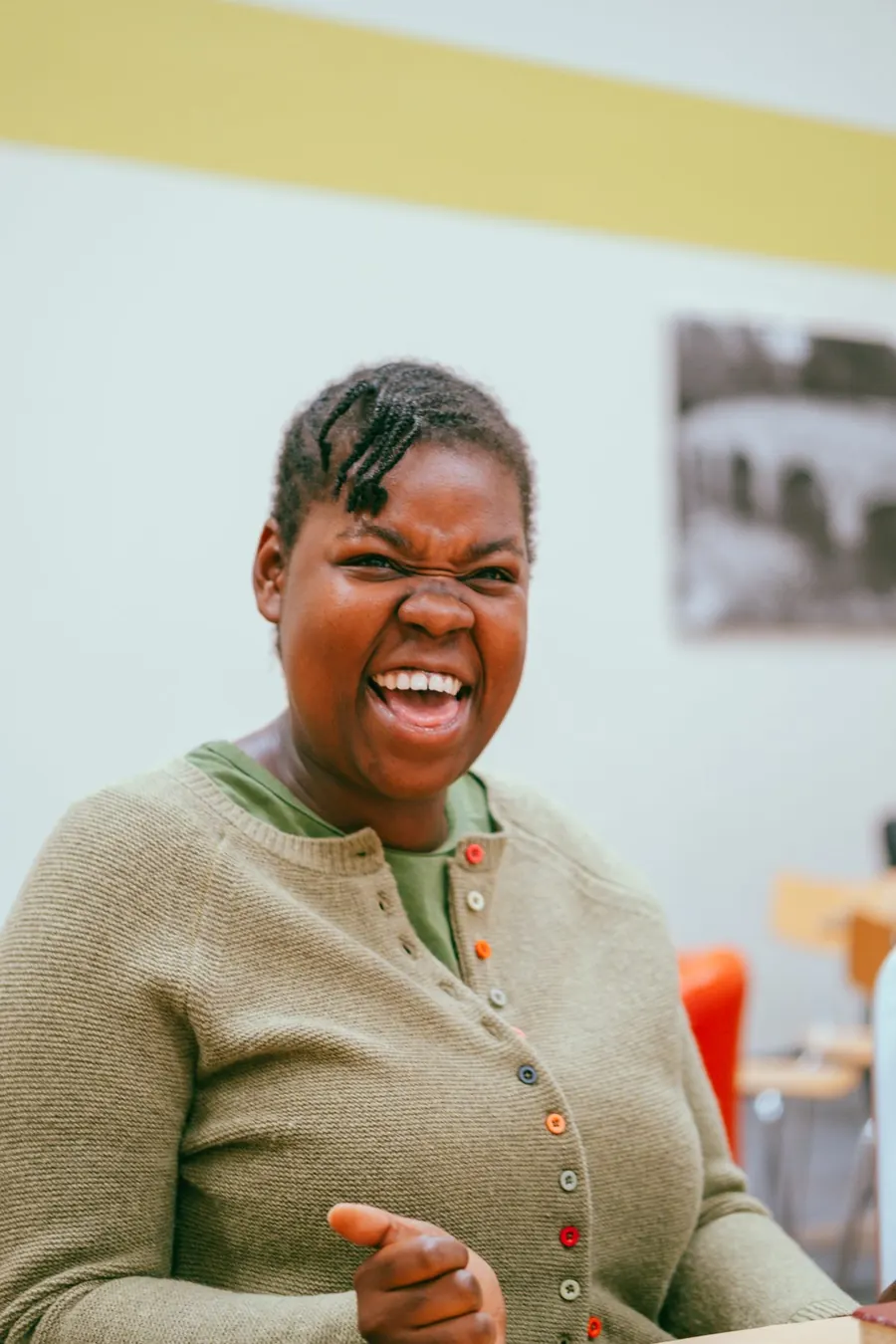
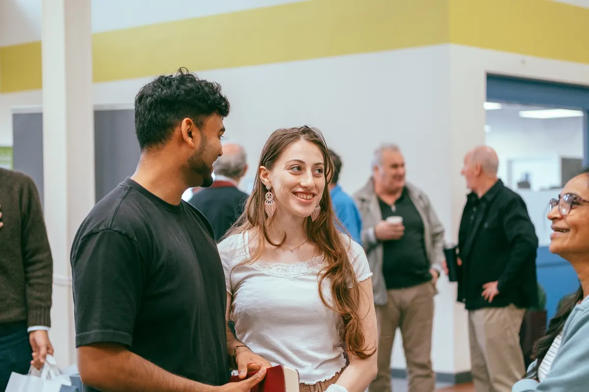
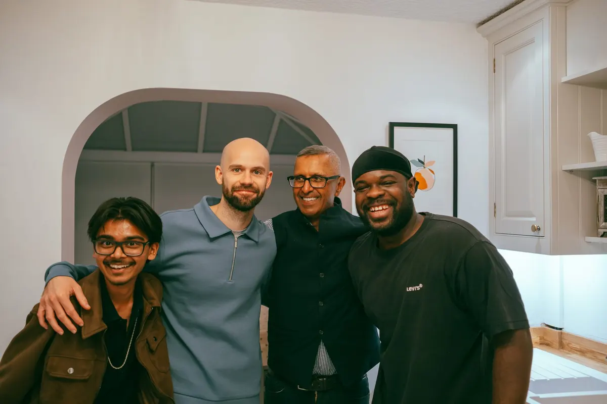
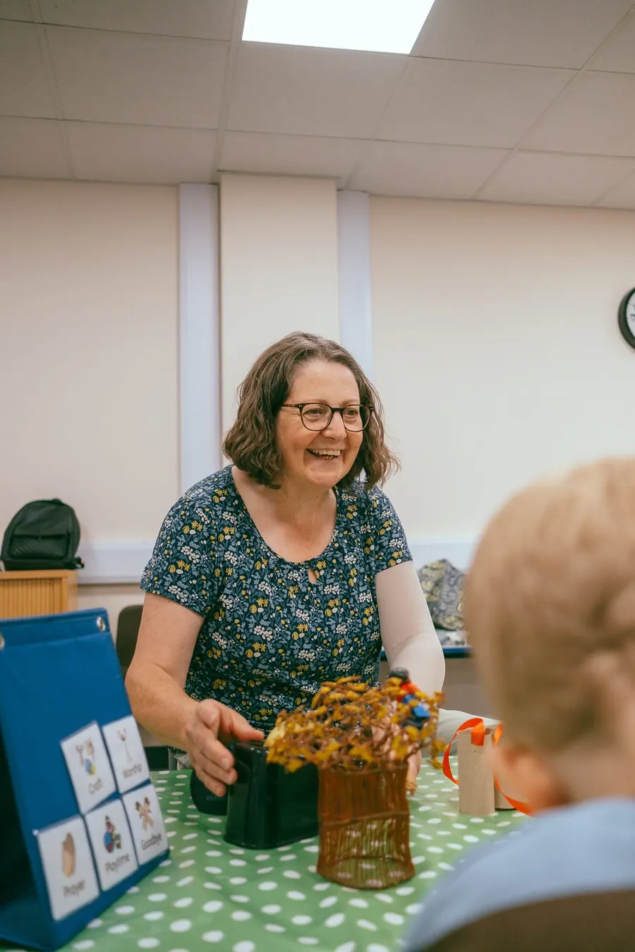
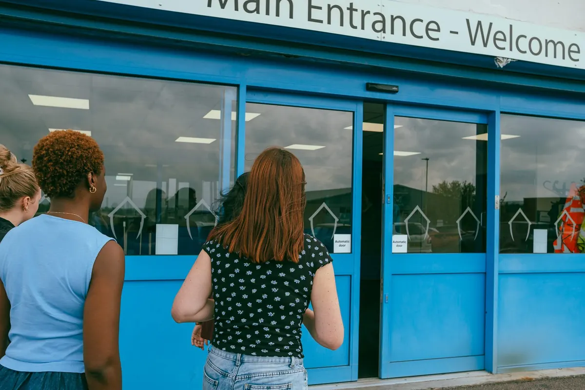
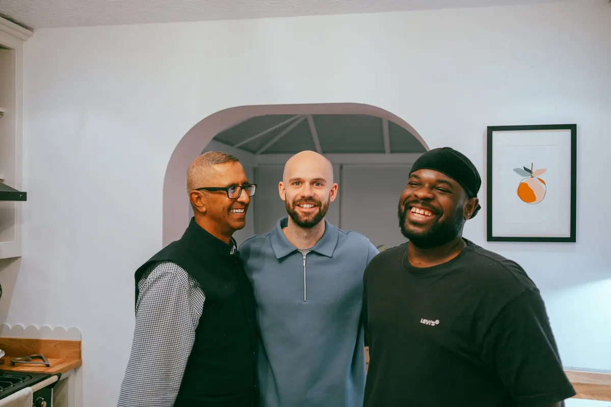
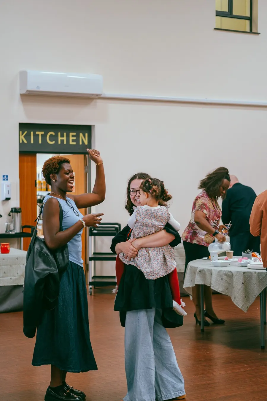
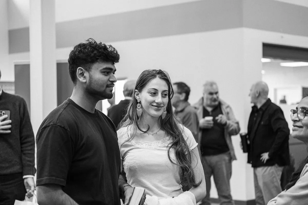
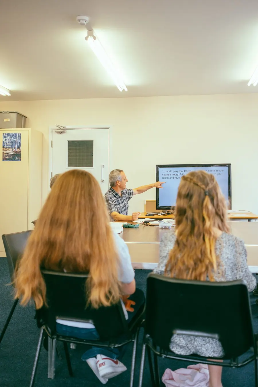
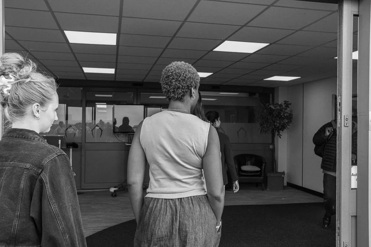
We photographed Sunday gatherings and Life Groups to give the brand its own library of real images. The brief was natural light, everyday people in relationship and candid moments, and to avoid stage lighting, staged shots and stock photography. The result is a set of images that looks like the church actually feels.
What we delivered
- Brand strategy workshops and strategy document
- Brand heart: purpose, mission, vision, values and "Only we" statement
- Audience personas and competitive landscape
- Messaging pillars, tagline and tone of voice
- Logo design and full logo suite
- Colour palette and typography system
- Brand identity presentation and asset delivery
- Webflow website design and build, with CMS
- Sunday and Life Group photography
Reflection
The most important work on this project happened before anything was designed. Because the church had done the hard thinking about who they are and who they are for, the creative decisions became clearer and braver. The loaf and cup only works because "the table is always set" was already true. And it is already working: since launch, the Plan a Visit form has been filled in every single week.
Let's talk
Got a story worth
telling well?
Book a free 30-minute discovery call and let's talk about where you want to go.
- 30 minutes
- Video call
- No obligation